Winnow
UI/UX
Winnow Digital Marketing delivers high-quality leads to clients through the use of their AI-assisted MarTech Platform. They capture these high-quality leads on a variety of digital advertising platforms including, Facebook, Instagram, Twitter, Amazon, LinkedIn & Google.
My role
Winnow had an existing product that their team was using. I was initially brought onto this project to improve the UI/UX of their internal platform (referred to as “Winnow Admin”) and elevate it from proof of concept to minimum viable product. After a few discovery sessions, we also decided to include a new feature; the campaign builder.
My team
In order to provide the best results within the ideal timeline, I partnered with a friend and peer who worked closely alongside me.
Chris Leyva
Sr Product Designer @ deepwatch
Our Process
- Discovery (show and tell)
- Research (affinity mapping)
- Planning (cognitive map; scope)
- Wireframe (low-fidelity)
- Prototype (high-fidelity)
- Delivery (development)
Discovery
We started with high level overviews of company goals starting with the big picture and narrowing in. Examining all Winnow products (internal and client facing) to gauge how the internal app played a role among the larger scheme of things.
First we asked Winnow to walk through their typical day-to-day tasks in the application on a team by team basis taking note of each teams flow and their objectives. We also asked to take note of any pain points for later. Then we performed a Usability Evaluation.
Research
Now it was time to come back to the pain points and analyze them a bit further. Using the affinity mapping approach, we had each team member write out their wants on sticky notes. Either resolutions to pain points or completely new items they wanted to see. Then organized them by priority in order to determine where there was overlap and which issues and wants were highest on the list.
Granted our goal was not to introduce new features, many of the wants were determined to be tied to UX issues and the complexity of the UI.
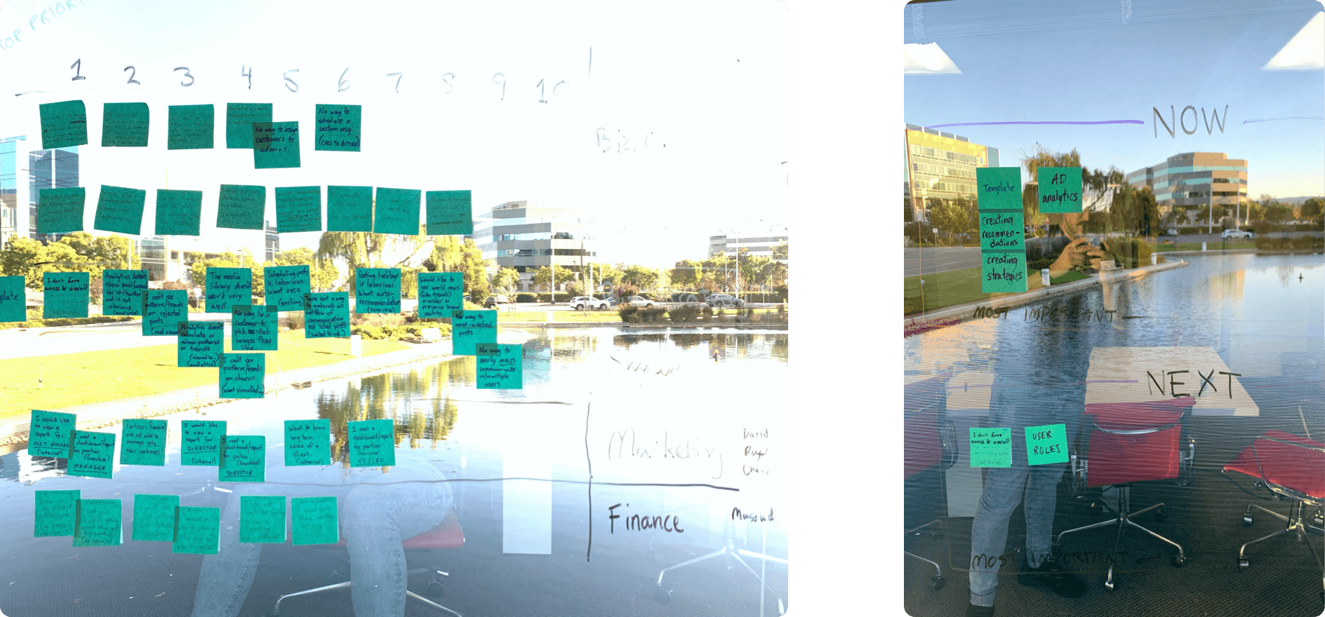
Affinity mapping
The Information Architechture was quite convoluted which lead to a confusing navigation. We decided to perform a card-sorting exercise in order to gain a clear understanding of what the iA should be which would help improve overall navigation.
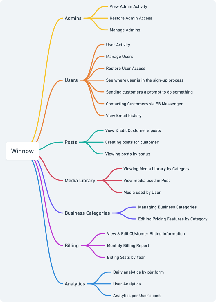
The result of the card-sorting exercise was a simplified IA and navigation
Planning
First we decided we needed to creating a concept map to scope out all the pages and flows at a high level. The goal was to brainstorm and include improvements to overall structure of the application to present to the stakeholders.
Granted our goal was not to introduce new features, many of the wants were determined to be tied to UX issues and the complexity of the UI.
Whimsical concept map
Wireframes
Initial lo-fi mockups were used to scope each screen as well as experiment with new solutions (eg. navigation). It also provided a starting point for deeper client feedback. The Winnow team was great at providing feedback as we pushed iterations live for the team to see.
Once we got a good spot we had a final presentation of the wireframes and approval from the stakeholders to move into the high fidelity mockups.
Highlight
The most notable achievement of working through the wireframes was improving the navigation. Many pain points expressed by the team seemed to circulate around the navigation - particularly in working with clients - which was the biggest area of use in the app.
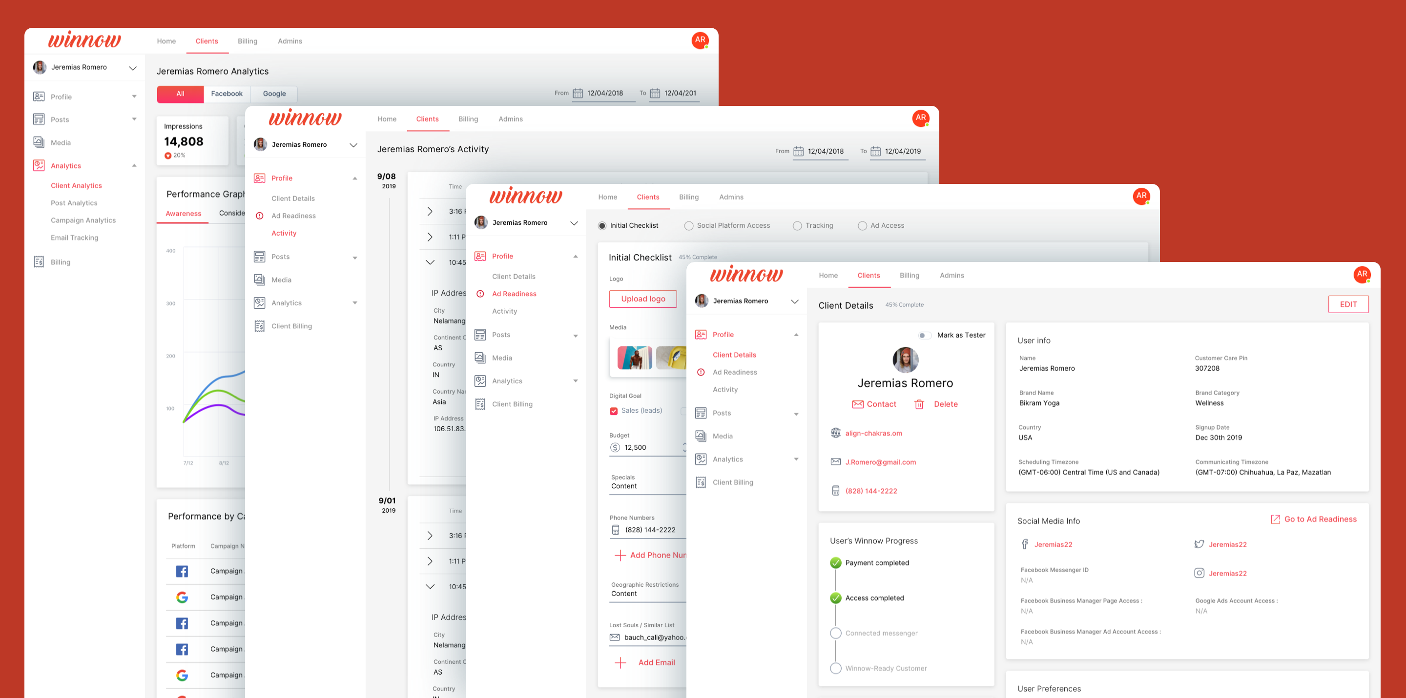
Previously when users were jumping to different pages of the app they needed to select the client they wanted to view every single time making it difficult to flow easily through the app. It was expressed that most often you’re working with one client at a time. So we changed the navigation to elevate the selection of the client as part of a top level item, highlighting which client was being worked on, and cascading the pages relative to a client underneath.
Highlight of client workflow
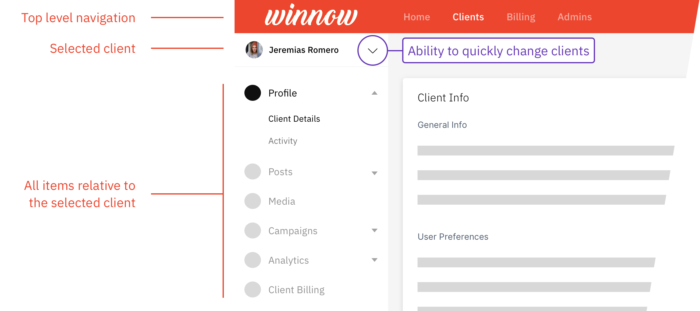
Client navigation example
Prototypes
The sexy hi-fi screens that became the deliverables. With the many steps of the process behind us, and the UX issues confidently resolved, this stage involved polishing the little details and giving a face lift to the UI.
After a final push we presented to the team and, after a couple of revisions, received a final seal of approval.
Below are some gifs highlighting parts of the new client workflows:
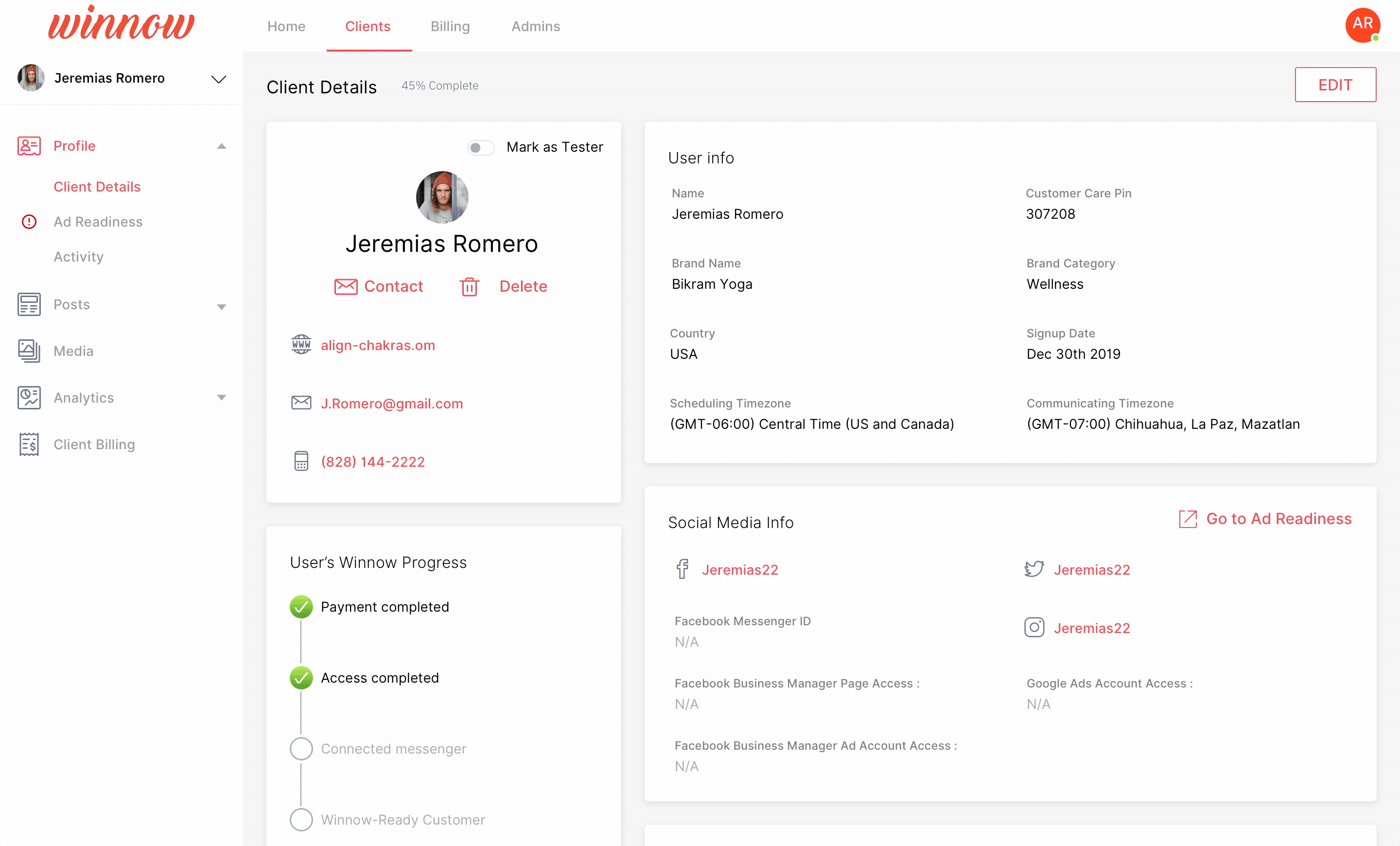
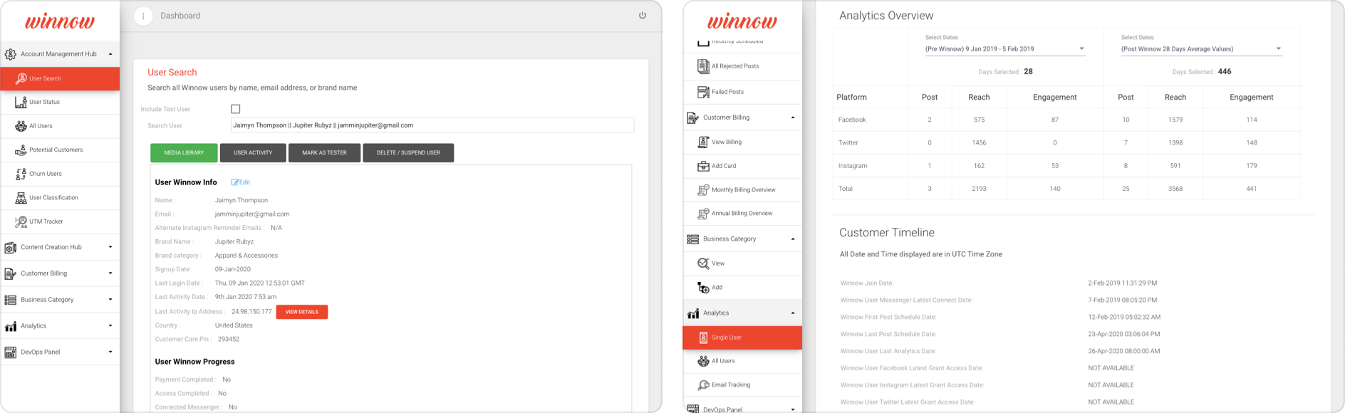
Client profile
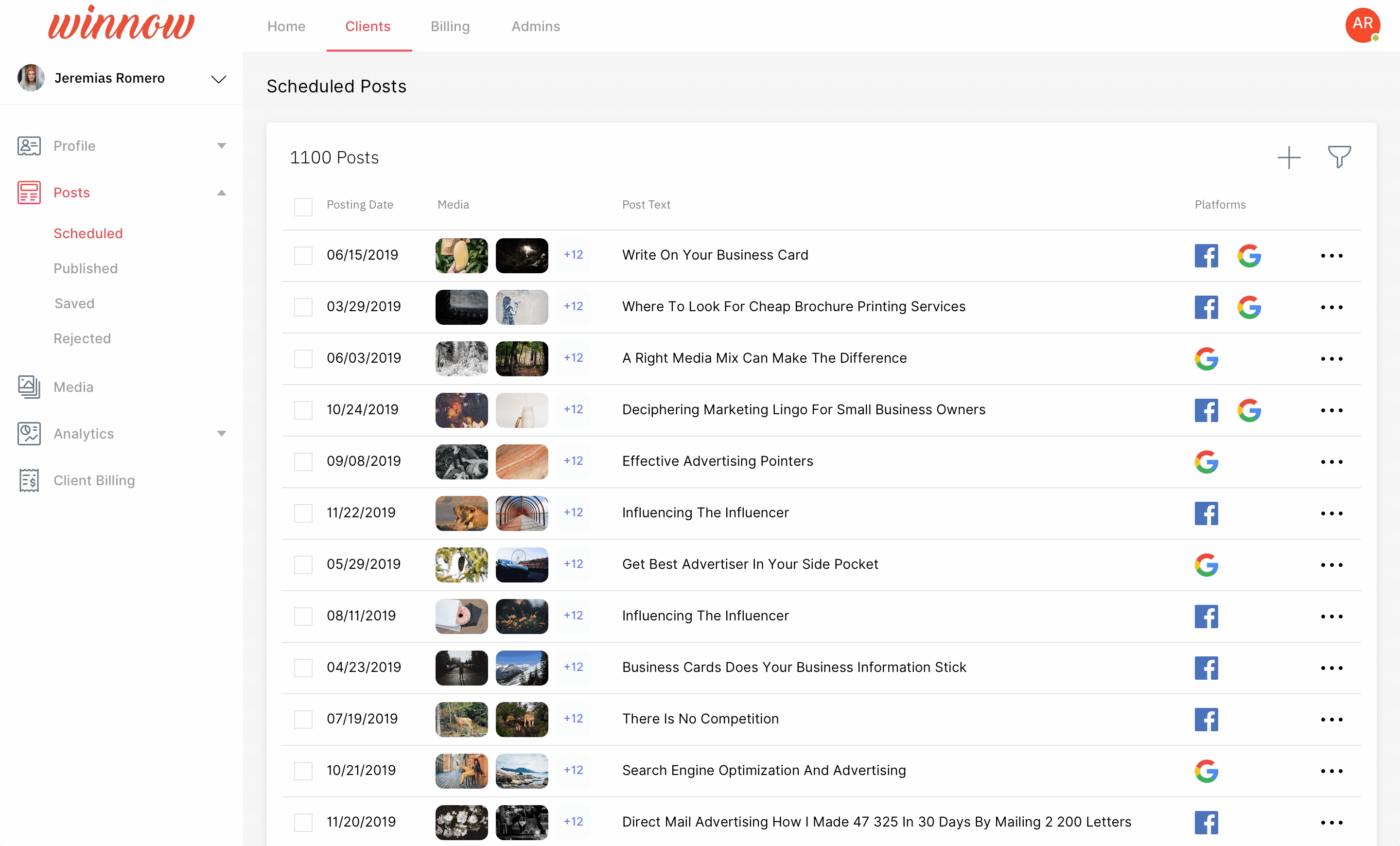
Client post creation
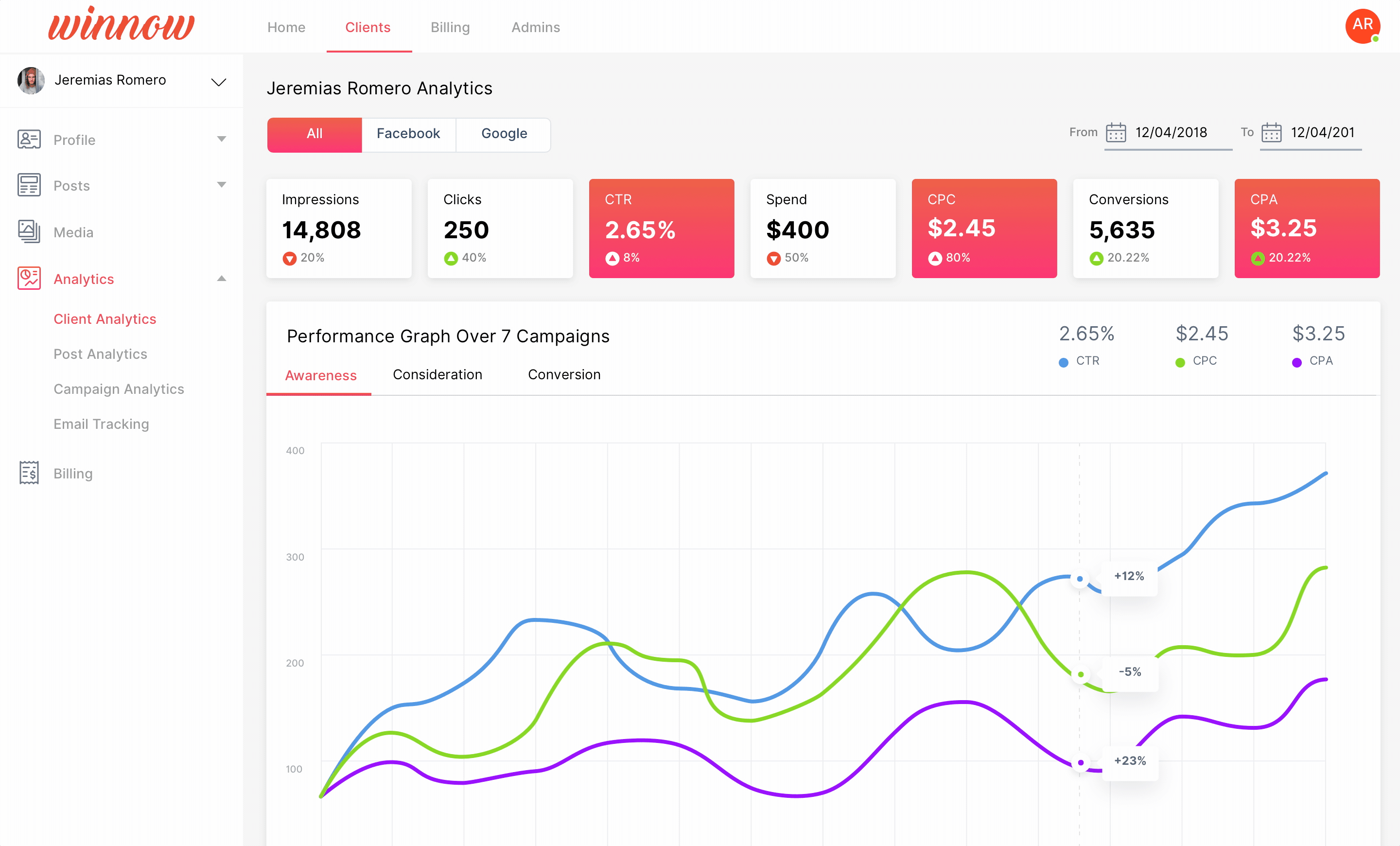
Client analytics
Delivery
The Winnow team previously only received static mockups (😱). So having taught them about InVision - which we were using throughout the process for feedback - they were very pleased to learn the advantages of modern technology. They were pleased with simply access to the InVision project and took the designs and ran with them.